Your website is the digital front door of your business. It’s a space to not only showcase your property but also share tips, local recommendations, and resources, and establish yourself as an authority in your area.
Wedding venue websites should do one thing: convert curious couples into booked tours. But too often, we see gorgeous event venues with digital footprints that feel like a ghost town. Let’s break down the top mistakes wedding venues are still making on their websites — and how to clean them up (before another couple books elsewhere).

1. No Info Above the Fold
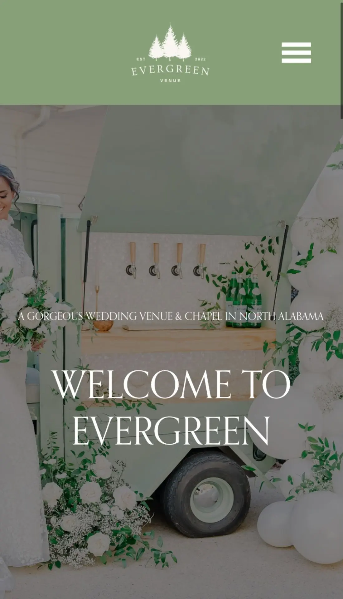
Couples shouldn’t have to scroll past a full-screen video just to find out where you’re located. That first screen matters. Your hero image (not a video!) should immediately tell visitors:
- Who you are
- Where you are
- What kind of venue you are
📍 Example:
H1: The Overlook Estate
H2: A Modern Mountain Wedding Venue in Asheville, NC
Give them an interesting hook. Then give them an opportunity to keep scrolling.

2. No Pricing = No Inquiries
We get it — you’re afraid of sticker shock. But not sharing anything pricing-wise doesn’t protect you from ghosting; it often guarantees it.
Today’s couples want transparency and the freedom to contact venues if they’re actually interested, not just for basic info. Give them starting rates, sample packages, or even a range. If you’re hiding your pricing, your competitors aren’t.
You’ll scare off the tire-kickers and attract couples actually ready to book. 😉
3. You Buried the Contact Info (Or Made It Weird)
Why is the contact button only on one page? Why do I have to fill out a form just to ask if you’re available? And why am I getting a text at 11:54 PM from someone named “VenueBot”?
Here’s what you actually need:
- Clear CTA buttons on every page
- One-click tour scheduling
- Easy-to-find email + phone (via a business email — not your personal Gmail)
Don’t overthink it. Don’t overcomplicate it.
4. Your Site Navigation is a Maze
If your top menu has 14 items, something’s gone terribly wrong.
Your site should guide visitors through a clear journey:
Venue Spaces → Packages → Gallery → Book a Tour/Contact Us
🔁 To make space, you could drop your “About Us” page in the footer unless it actually helps conversion or is very important to your vision. (It usually doesn’t.)

5. Your Gallery is a Hot Mess
Dark photos. Vertical screenshots. Styled shoots from 2017. Couples can’t envision their day in your space next to old or blurry wedding ideas.
Here’s what you should be showing off…
- All seasons
- Multiple ceremony/reception setups
- Real weddings (with real people!)
- Happy couples and moments — not just chairs and florals
Use web-optimized, mobile-first images (preferably .webp) and skip the slideshow plugins from 2009.
6. Slow Load Times = High Bounce Rates
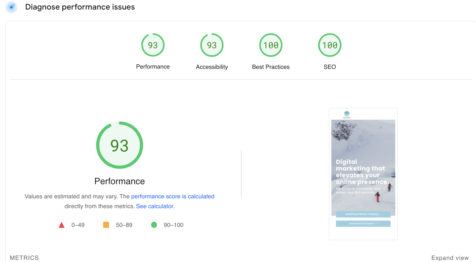
We love a stunning site as much as the next marketer, but if it takes 8 seconds to load on mobile, you’ve already lost them.
💡 Speed it up by…
- Compressing and resizing images
- Eliminating unneeded plugins
- Avoiding autoplay videos and Instagram feeds
- Using a lightweight SEO plugin (RankMath > Yoast)
- Installing a caching plugin like LiteSpeed Cache (or host with us and we’ll take care of all that)
Google does care how fast your site loads — and so do couples planning from their phones on a lunch break.
7. No Local SEO Strategy
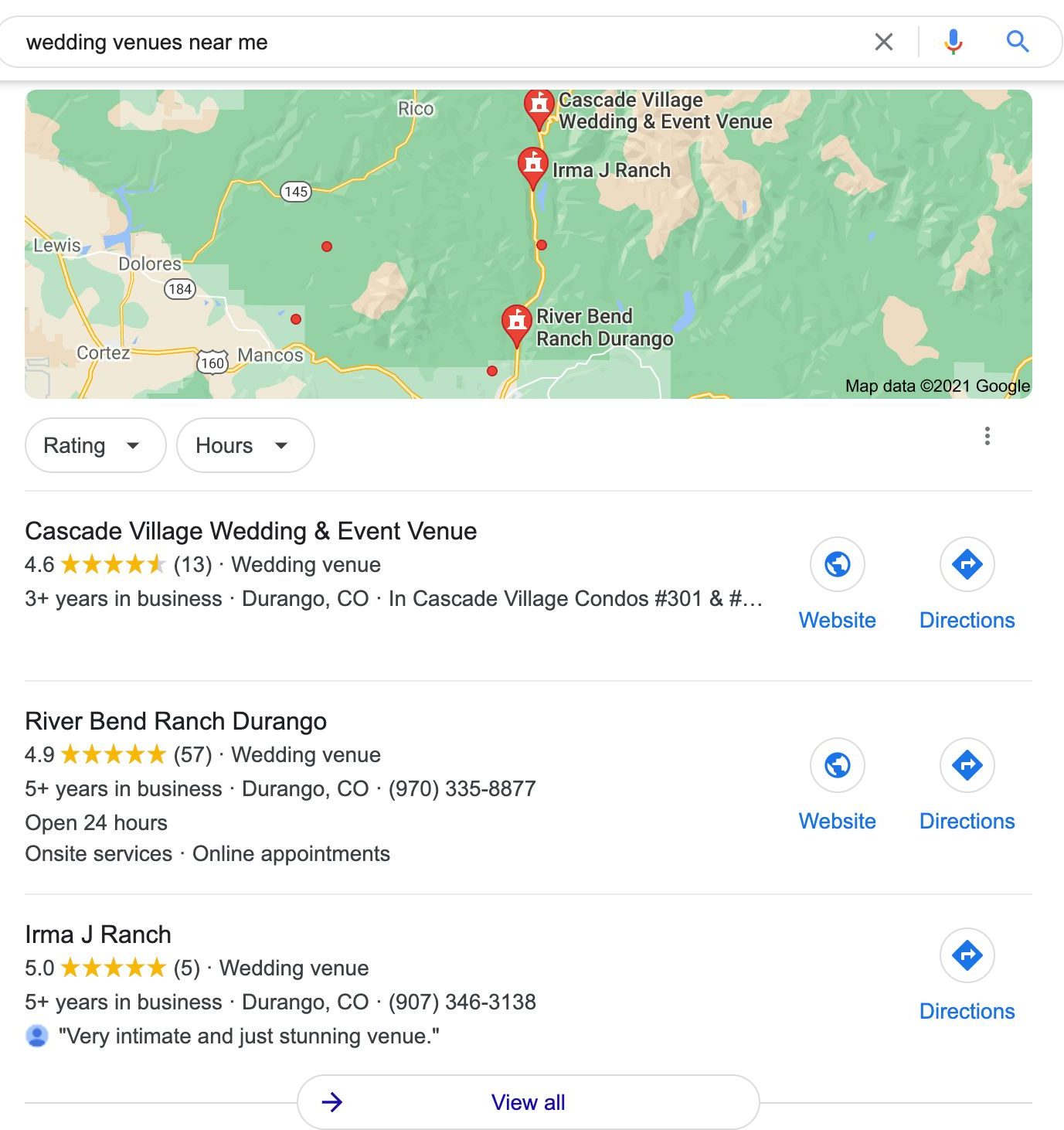
You’ll never outrank The Knot or WeddingWire on a national level — but you can dominate Google Maps and local search results.
That means implementing…
- Location-based keywords (like “wedding venues in [city]”)
- Google Business Profile updates
- Backlinks from local vendors + blogs to help establish site authority
- Interlinking pages for services, packages, or events
We’ve helped clients go from Page 6 to Page 1 without blowing their ad budget. It’s not magic — just smart SEO.

8. You’re Not Showing Off Your Value
Most venues list features. Great ones sell benefits.
What makes you different?
- In-house catering? Talk about how it simplifies planning.
- Weekend rentals? Emphasize how couples get more time with loved ones.
- No vendor restrictions? That’s creative freedom, baby.
Spell it out like they’ve never been on a wedding website before — because many haven’t.

9. No Clear Call to Action
“Learn More” is not a CTA. Your site needs bold, action-oriented buttons in every section.
Examples:
- “Book a Tour”
- “See Starting Rates”
- “View Gallery”
- “Check Availability”
You need a CTA in your header. Yes, always. No, it’s not optional.

10. Your Site Feels Like 2015
Script fonts and pastel blush don’t scream modern luxury anymore.
Today’s couples want clean, editorial, mobile-first design. If your site hasn’t been updated in years — or it’s built on a platform you haven’t logged into since the pandemic — it’s probably time.
If your website doesn’t reflect the experience you offer IRL, you’re losing leads before they even call.

✅ Quick Fix Guide | Do’s & Don’ts for Wedding Venue Websites
|
Do This |
Not That |
|
Show pricing upfront (even if it’s a range) |
Hide pricing behind a contact form |
|
Use one killer hero image with location + venue type |
Start with an autoplay video that slows everything down |
|
Offer 1-click tour booking or scheduling |
Make couples email you just to ask if you’re available |
|
Keep your nav menu clean (5–7 items max) |
Cram 13 buttons and 4 dropdowns into your top bar |
|
Use fast-loading, mobile-optimized images (.webp preferred) |
Upload full-res .pngs that take 12 seconds to load |
|
Use clear CTAs like “Book a Tour” or “View Our Pricing” |
Say “Learn More” 12 times and hope for the best |
|
Refresh galleries yearly with pro shots from real weddings |
Keep that one styled shoot from 2016 on repeat |
|
Optimize for local SEO (“wedding venues in [city]”) |
Rely on The Knot and Facebook and cross your fingers |
|
Add Google Business updates + local backlinks |
Ignore your listing and wonder why you’re not ranking |
|
Partner with experts who know the wedding industry |
DIY everything and get overwhelmed by plugins and SSL errors |

💻 Hosting, SEO & Web Design — Done Right
At Snowmad, we don’t just build pretty websites—we build fast, secure, search-optimized machines that convert. Whether your site just needs a glow-up or a full rebuild, we offer:
🚀 Kinsta Hosting (No Headaches Attached)
- No messing with SSL certificates
- No broken caching plugins
- Enterprise-level speed + security
- Daily backups, malware scans, and performance optimization
- Managed hosting that actually works

🔍 Wedding-Industry SEO Strategy
- Real SEO, not just keyword stuffing
- Local-first targeting for “wedding venues in [city]”
- Smart content strategies that rank over time
- Google Business optimization + backlink campaigns
🎨 Custom Web Design That Converts
- Built specifically for wedding venues
- Not just “looks nice,” but functions like a booking machine
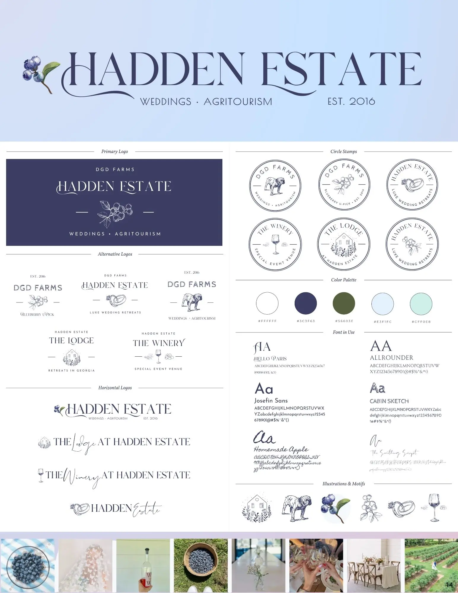
- Clean, editorial brand kits and design that feel modern and fresh
- Mobile-first (because that’s where your leads are)

Your Website Is Your First Impression
Your venue might be jaw-droppingly beautiful, but if your website is clunky, slow, or outdated? You’re losing leads you never knew you had.
Every one of these mistakes is fixable — and the fixes start with a conversation.
View this post on Instagram
👋 Ready to build a site that actually books weddings? Let’s talk — or grab a free audit and see where your site stands.


